Learning Futures Architect


You may also like
Browse
Search
-

-

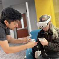
Education / Featured / Next Lab at ASU
ASU’s Next Lab charts the future of skills and tech
October 11, 2023
-
-

Conference Speaker / Education / Featured / Next Lab at ASU
The Arc of Truth and the Right to Be Curious
March 19, 2025
-
